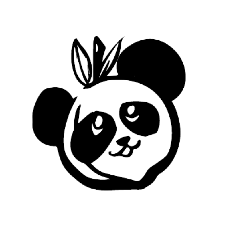
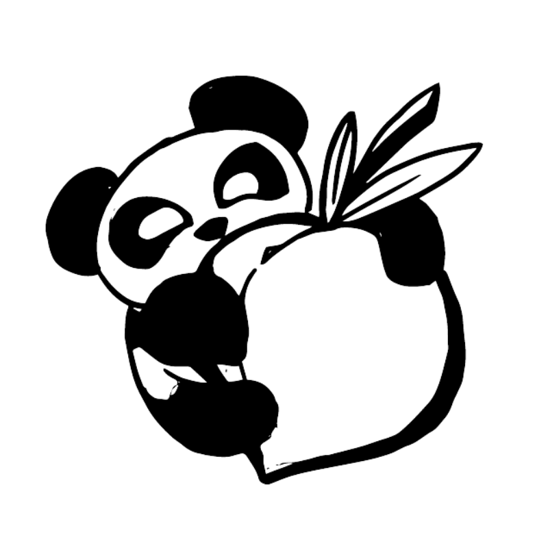
Because pandas are a popular animal to choose as a mascot, I knew I wanted the logo design for this client to be as unique as possible while remaining accessible and recognizable. In several of the early sketches, I searched for a panda design that was simple, but also neatly combined the peach part of the name with equal emphasis.
Eventually three concepts emerged that we presented to the client initially; the “cute” concept, the “cheeky” concept, and the “literal” concept. (There was previously a fourth “tough” concept rooted in the sketched ghostly panda faces, but it was decided early on that the “tough” concept would not be moving forward.)
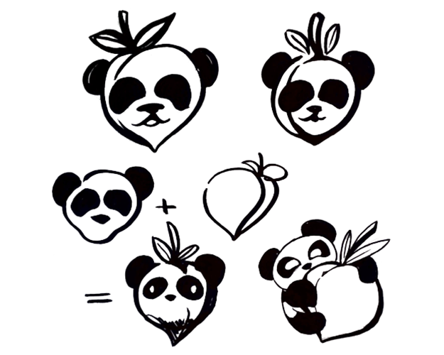
Firstly, the “cute” concept drew more inspiration from peach and panda designs found in Japanese media and packaging. Next, the “cheeky” concept was a play on the word cheek, which is sometimes used as another word for part of a butt, and finally the “literal” concept was the simplest, as it was a literal reflection of the client’s business name.
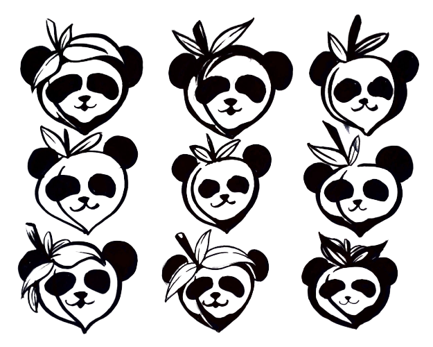
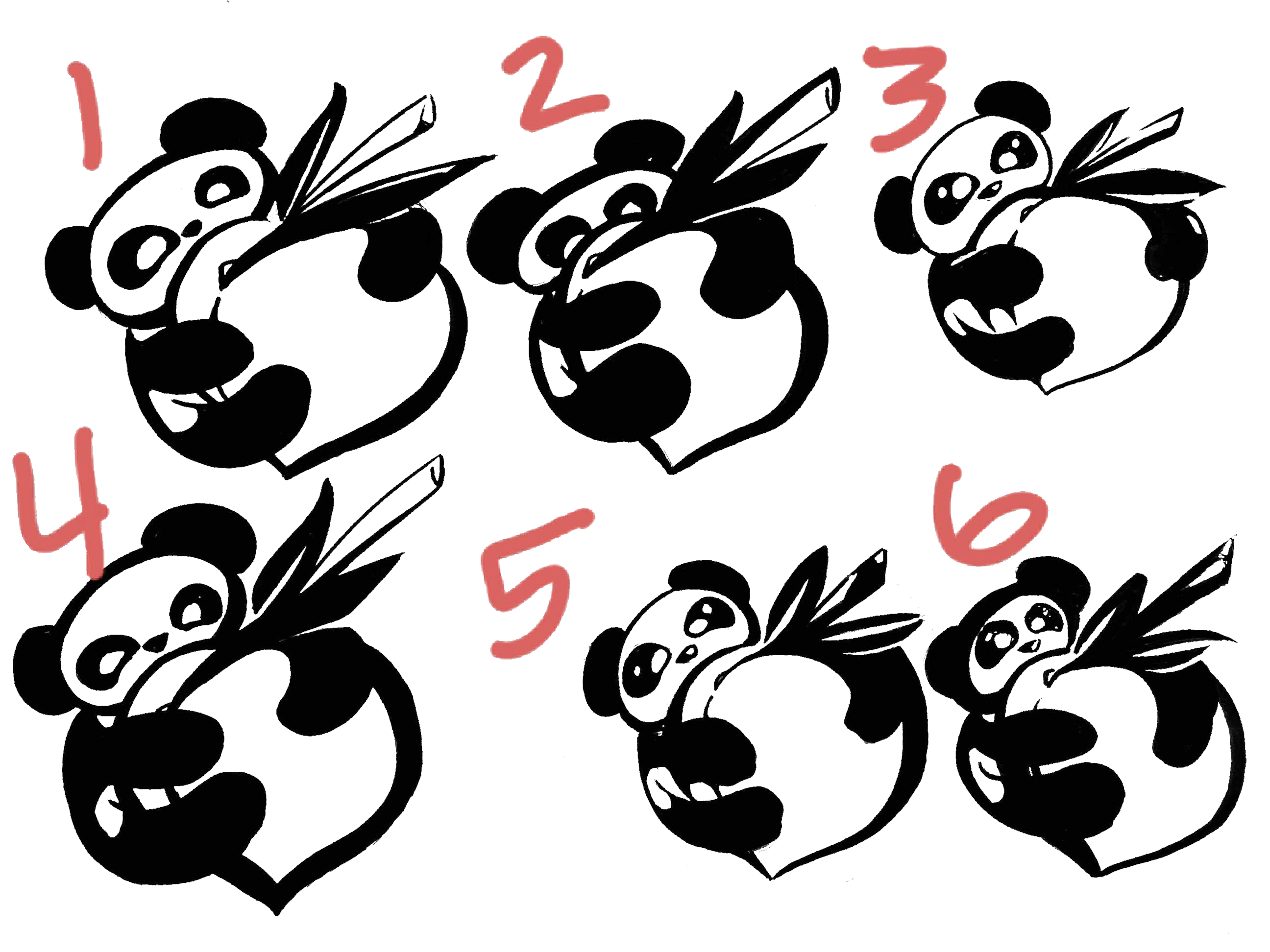
The client ended up choosing the more literal concept, and the next round of revisions began. These were shorter since I was narrowing down the design to a fine point, and I presented the above six sketches to see which parts would go into the vectorization part of the process.
This turned out to be a good approach, as they gave very specific feed back to what parts they liked the most that should go into the final design. The layout of #5, the stem shortness of #3, the stem detail, eye, and ear shape of #4, and the peach shape of #3 or #5.